Showing posts with label font. Show all posts

Tuesday, 20 September 2016

I'm with the band - Los Ladillas, fuegian krautrock.

Since March I've been working with the band Los ladillas - 'crab lice' in spanish but also slang for slacker - a krautrock band from my hometown Ushuaia, in deep Patagonia.
The musicians were kind enough to let me visually explore their music and allowed me to listen to their material from  early jams to live recordings while I developed their logo and promotional artwork for their concerts.
The process took place purely online, with records and images travelling between Argentina and Scotland via the cloud. We paced the work around our our lives and that somehow gave us the illusion of being in a more analogic time when with tapes or drawings will have to travel across continents inside envelopes. That absence of the immediacy that the internet brings to everything in our lives nowadays it's reflected in the final results with both music and artwork.
The final result is the two ep's the band have now released online - bold move me thinks - and today I'm sharing the covers I've designed for them.
I should probably mention that I love this guys and I'm almost certain after listening to their music you may love them too.
Aguante ladillas!


Chacarero botón; Los ladillas - 2016


Los putos de la montaña; Los ladillas - 2016


Friday, 1 June 2012

Go for Gold! - Befriending Scheme's new campaign

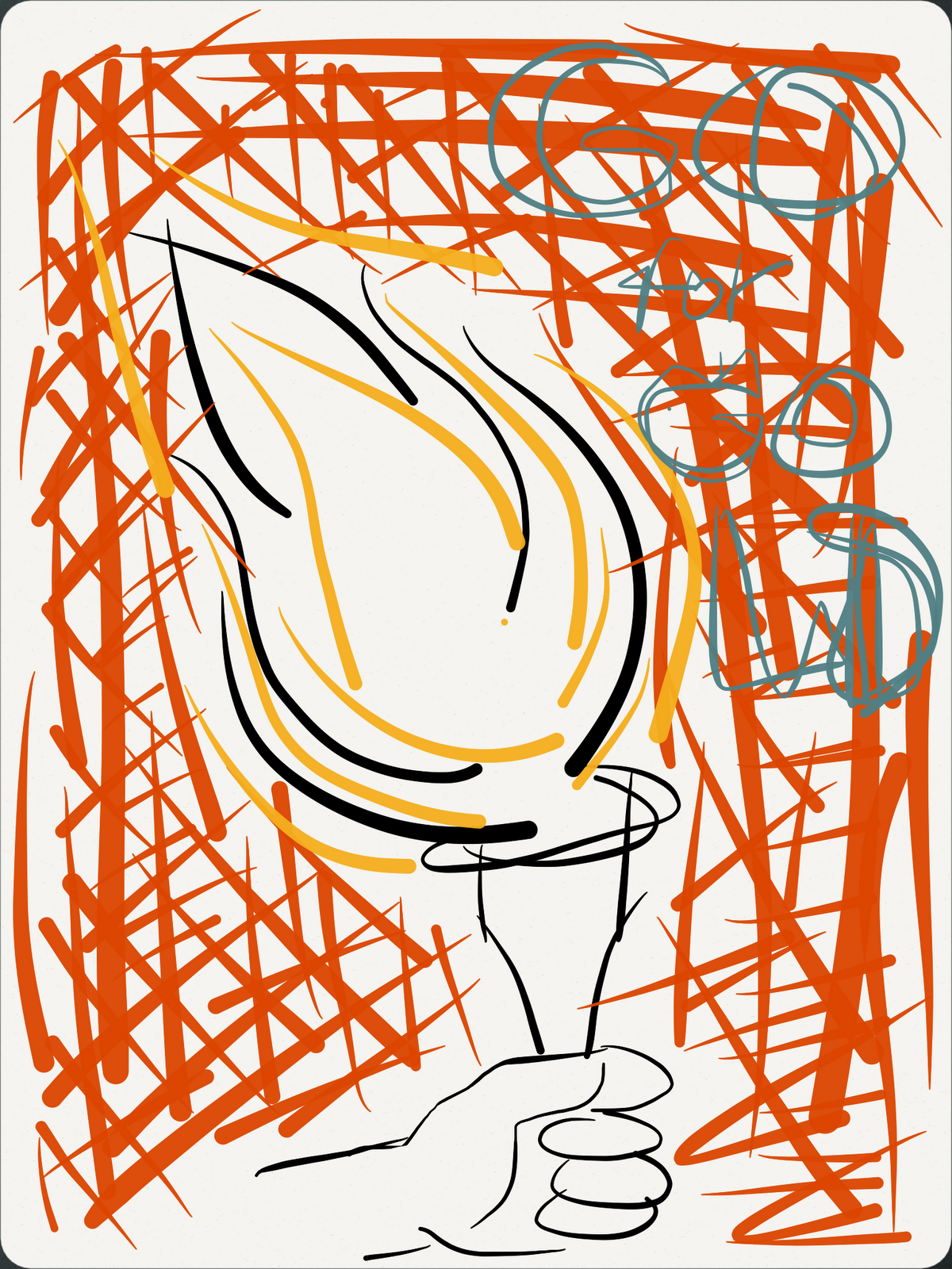
The 2012 Olympics are almost here and Shetland Befriending Scheme has chosen the eternal flame to promote their recruitment campaign. When I received the briefing to start the design process, there was a tiny note saying "fire writing?" as to suggesting that this could be a possibility. Never did I think I would be able to follow that road (crazy! I know, fire fonts, I'll never get that right) and looking back to the design process, all early sketches have the motto in some sort of bold-classic font away from the torch. To help me thumbnail and explore colours I used for the first time Paper by FiftyThree App. The app is a very basic notebook with simple tools for drawing and taking notes, this helped me focus on working ideas instead of wasting time drawing a detailed final image.
A few images from the process and the final image below.

First doodles

Exploring colours - Orange/Black/White

Flame writing? Too complicated

Developing the idea

Free hand try, the breakthrough

Finding my feet

Exploring poster layout

Process comparison

Poster final version

The final image - Nice fire typography!

Friday, 25 May 2012

Album covers reimagined; Spinetta mini-tribute

A self initiated project continuing from the Handmade Design Class 2011 with Jono Sandilands. Started with some potato prints and eventually turned into reworking some album covers. At the time I chose some of Luis Alberto Spinetta's albums and halfway thru the process news broke that he had contracted cancer and early this year he passed away. The two album covers I reimagined are Artaud -1973- and Alma de diamante (Diamond soul) -1980- You can check them out in Spotify by clicking here Artaud and Alma de diamante and in fact if you have Spotify I recomend you give Spinetta's extensive discography a try
Playing with food - Potato diamond stamps
Test potato print

Playing with sissors - Alma de diamante, process

Alma de diamante, Spinetta Jade - 1980

Artaud, Pescado Rabioso - 1973


Tuesday, 18 October 2011

Time to listen (and look)

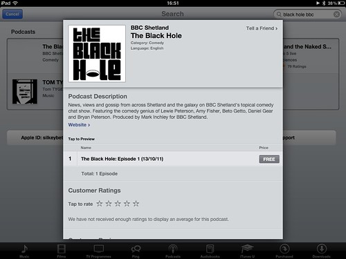
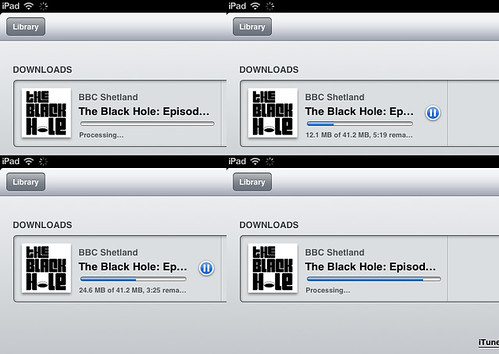
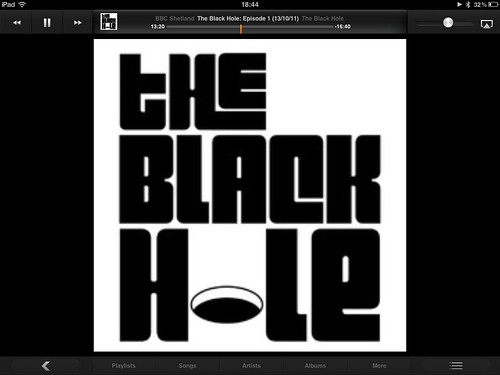
I have to admit it was kind of nice downloading the podcast for the radio program we started doing last week. But as I listened to it on my iPad I couldn't help looking at the logo I put together a couple of weeks ago and finding tiny little things I could improve. Here is a few snapshots of how the logo looks in iTunes and make sure you get the podcast HERE
iTunes host to the podcast!
downloadin podcast
the podcast